I work with Raphaël on many projects on an ongoing basis. Raphaël is an absolute pleasure to work with. He has endless patience and provides true service with a smile. He is the person to call on for all types of work from short and urgent to long-term and complex. He can be trusted to deliver quality work every time. Renana Typesetting is the ultimate address for highly skilled, creative, professional work.
Dates use the first edition in the language and format shown where verified. Other entries retain their recorded work dates while we check them. Books without a confirmed date follow alphabetically.
English typesetting in Arno combines a single-column reading text with small-cap book and chapter running heads and outer folios. Superscript note calls lead to collected endnotes, where hanging numbers, italic publication titles and page-range headings organise the references. Dialogue and extended quotations retain distinct paragraph spacing and speaker labels.
English narrative in Arno combines indented paragraphs with chapter openings marked by small-cap numbers, fine rules and drop capitals. Small-cap book headings and italic chapter headings guide the reader. A separate photograph section accommodates archival black-and-white and colour images with carefully placed multi-line captions.
A single-column English guide with numbered Hebrew source notes set right aligned at the foot of the page. Centred capital headings and smaller mixed-case subheadings organise the practical guidance, with bullets and small-cap question labels for lists and questions. Chapter openings combine a small-cap chapter number, fine rule and large bold title; running heads and outer folios guide the reading pages.
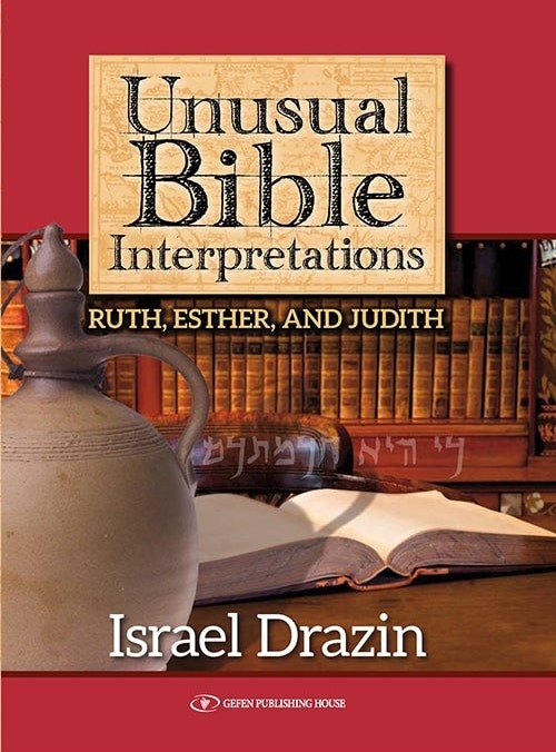
English and Hebrew typesetting for this guide to Esther. Vocalised Hebrew verses sit directly above bold English translations, followed by commentary with bold quoted phrases. The earlier narrative sections use centred subheadings and italic summaries; chapter openings pair small-cap numbers, a fine rule and a larger title. Single-column text and alternating running heads keep the sequence clear.
This Hebrew practical guide combines a single text column with narrow sans-serif subheadings and lettered lists of rulings. Compact numbered source notes sit below short rules, while chapter running heads and outer folios maintain a consistent structure across the changing lengths of the sections.
Single-column English commentary incorporates pointed Hebrew sources and their English translations. Large sans-serif portion headings and fine rules distinguish the main divisions, while bold essay titles, italic transliterations and paired book and portion running heads organise the shorter discussions.
Hebrew commentary uses a single right-to-left column with bold subheadings and numbered explanations. In the verse-by-verse section, pointed and cantillated passages from Esther alternate with unpointed commentary; chapter running heads and outer folios keep the changing text lengths within a consistent page structure.
Typesetting brings vocalised Hebrew verses and their numbered English translations together in grey panels, alternating with bulleted commentary. Bold italic headings distinguish the longer literary analyses, with smaller italic subheadings beneath. Superscript references, occasional footnotes, running titles and outer folios organise this study of Lamentations without obscuring the verse-by-verse structure.
Hebrew
ואיתרע מזלו של יהודי להיוולד בבור עמוק ולגדול בתוכו
Hebrew narrative and reflection use a single right-to-left column, centred asterisk separators and compact ruled footnotes accommodating Hebrew, Latin and Greek. Bold chapter openings and paired running heads organise the text; a separate photograph section combines archival images with Hebrew captions.
Quill ornaments, italic chapter labels and shaded introductory panels introduce each group of biblical questions. The single-column pages combine hanging bullet lists, italic transliterations and small-cap running heads; a compact two-column index provides a distinct reference layout.
Typesetting for an English study of Genesis, with vocalised Hebrew terms embedded in the prose. Coloured verse extracts, indented quotations, numbered arguments and a ruled comparison table distinguish the source material. Compact footnotes sit below fine rules; chapter openings combine an italic number, a short rule, a bold title and a drop capital.
English typesetting for a study of Genesis that combines vocalised Hebrew, transliteration and biblical commentary. Centred section titles and small-cap verse references introduce Hebrew extracts with English translations beneath. Bold phrases and italic transliterations distinguish the linguistic discussion; indented examples, ruled footnotes and chronology charts with source captions add further levels of information.
English typesetting for this guide to Israeli life, combining continuous narrative with interviews and reference material. Bold questions separate interview passages, while subsection headings, a two-column comparison and a ruled grid vary the page structure. The glossary uses bold entry words beneath a large opening title; small-cap running heads and outer folios connect the sections.
English typesetting for this illustrated memoir. Single-column narrative is combined with black-and-white photographs and centred sans-serif captions. Bold subsection headings break up the prose, while chapter openings pair a letterspaced chapter label and short rule with a large italic title. Small-cap running heads, outer folios and occasional ruled footnotes maintain the page structure.
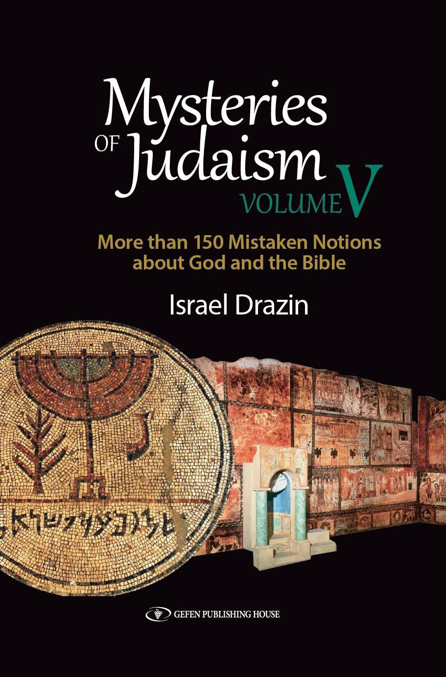
English typesetting for the fifth volume of Mysteries of Judaism. Chapter openings combine a quill motif, italic chapter label, centred title and grey introductory panel. Small-cap subheadings, bulleted questions and numbered discussion points organise the single-column prose, with book and chapter running heads linking the pages.
Right-to-left Hebrew text combines continuous prose with question-and-answer sections, numbered lists and inset source quotations. Bold sans-serif subheadings distinguish short topics from the serif body text, while paired book and chapter running heads and outer folios provide a consistent framework.
Hebrew recollections use a single right-to-left column with bold subheadings, indented paragraphs and paired running heads. Black-and-white drawings by the author are integrated with captions and surrounding text; occasional centred song quotations provide a contrasting rhythm within the prose.
Hebrew typesetting for this illustrated account of the Yom Kippur War, with right-to-left narrative and a hierarchy of headings for the order of battle. The pages combine wrapped portraits, larger black-and-white photographs, colour maps and captioned QR codes. Sans-serif captions and running heads distinguish supporting material from the main Hebrew text.
Typesetting for an English guide linking parenting with the weekly Torah portion. Serif prose is paired with bold sans-serif subheadings and rounded grey For Discussion boxes, whose questions use a contrasting sans-serif face. Large, light chapter headings mark the parashah openings; italic transliterated terms and running heads provide detail within the consistent single-column layout.
A single right-to-left Hebrew column carries this memoir, with indented paragraphs, bold subheadings and spacious chapter openings. Enlarged initial letters introduce chapters; book and chapter running heads distinguish the facing pages, with chapter-opening folios centred at the foot.
Typesetting for an illustrated English biography of Giacomo Meyerbeer. Single-column prose incorporates indented documentary quotations, italic titles and superscript note references. Portraits and medallion images have centred italic captions, while compact footnotes sit below short rules. Small-cap running heads and outer folios provide continuity across the pages.
English typesetting for this study of Elijah. Italic chapter numbers and a small staff illustration introduce shaded chapter summaries, followed by single-column prose. Letterspaced small-cap subheadings, indented numbered lists and compact ruled footnotes organise the discussion. Alternating book and chapter running heads keep the short sections easy to navigate.
This Hebrew translation of Thou Shalt Innovate uses a right-to-left, single-column setting with bold subheadings, superscript note references and alternating running heads. The endnotes bring Hebrew references, Latin titles, dates and web addresses together in compact numbered entries with hanging alignment.
Arno text gives this memoir a steady single-column rhythm, with italic chapter titles, numbered openings and clear subheadings. Handwritten-style quotations beside fine vertical rules provide a contrasting voice, while longer quotations and their indented source credits retain a separate hierarchy.
Single-column text pairs serif body copy with sans-serif running heads and small-cap subheadings. Illustrated chapter openings use italic epigraphs and captions; compact endnotes and a two-column index support the narrative. ReWalk photograph: Mikhnenko773, CC BY-SA 4.0 (https://creativecommons.org/licenses/by-sa/4.0/).
This Hebrew edition of Faith at the Brink combines single-column narrative with captioned historical images and numbered footnotes. Bold chapter openings and alternating running heads establish the hierarchy; italic Latin quotations, Hebrew translations and mixed-direction references sit within the right-to-left page structure.
Serif single-column text is divided into short thematic passages with bold subheadings and small-cap running heads. Captioned historical photographs and book images sit alongside the translated writings, while italic transliterations and compact source references distinguish names, titles and quotations.
The Hebrew translation of A Passion for a People uses a compact single-column setting with alternating part and chapter running heads. Numbered chapter openings combine centred titles, fine rules and italic quotations, while clear subheadings and indented paragraphs organise the discussions of Jewish peoplehood.
Single-column serif text uses centred chapter openings, italic subtitles and clear paragraph indents. Part dividers introduce displayed questions and quotations; numbered references lead to notes, and a compact two-column index uses hanging entries and nested subentries.
Hebrew single-column narrative combines indented paragraphs, running heads and historical photographs with captions. Latin-script names and titles are integrated into the right-to-left text; documentary song texts preserve their original lineation, and a separate Latin-script bibliography uses hanging entries.
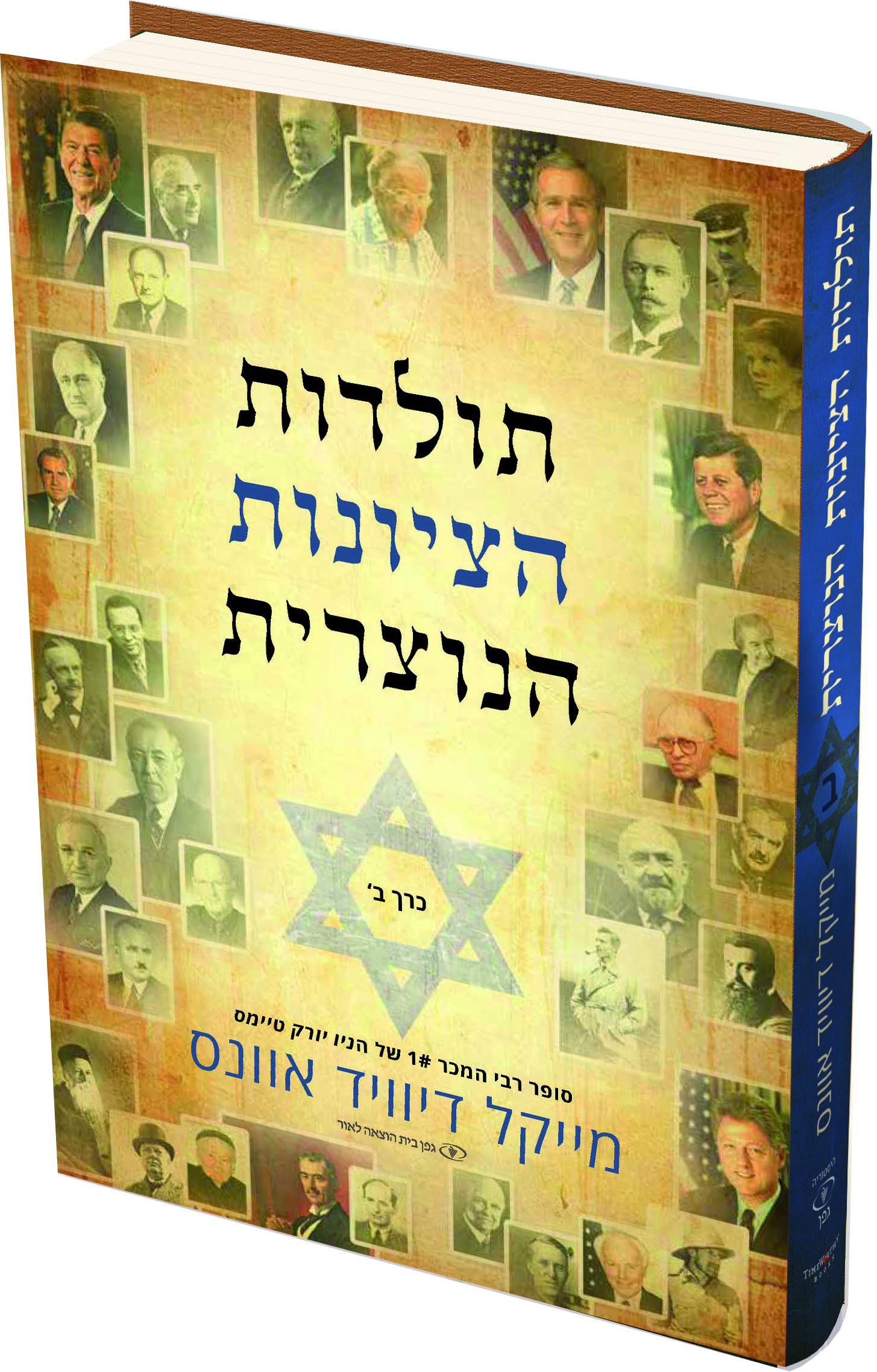
The second Hebrew volume continues the ornamented chapter openings, dropped letters and captioned historical photographs. Right-to-left narrative incorporates italic Latin titles and quotations; documentary appendices use centred headings and indented lists, followed by a Latin-script bibliography with bold author names and hanging entries.
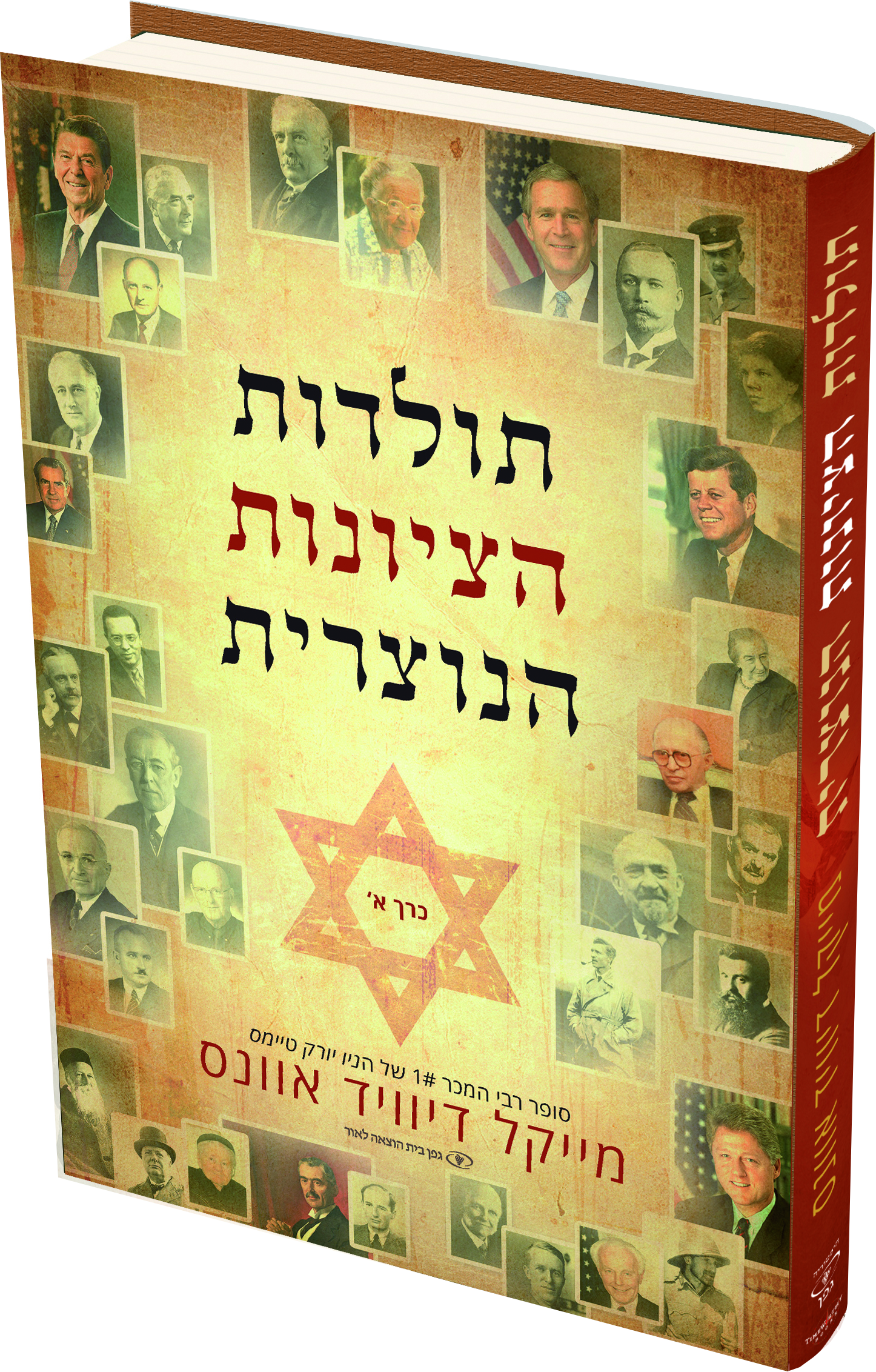
The first Hebrew volume of The History of Christian Zionism pairs single-column narrative with captioned historical collages. Ornamented chapter openings use centred epigraphs and dropped Hebrew letters; italic English titles, inset quotations and alternating author and book-title running heads retain a clear hierarchy.
Bilingual poetry typesetting places the pointed Hebrew original beside its English translation on each page. Short lines and stanza breaks remain distinct in the two reading directions, with numbered sections, compact translator’s footnotes and generous space around the verse.
The Hebrew translation uses single-column text with bold subheadings, italic emphasis and alternating running heads. Shaded inset passages span facing pages, while numbered chapter openings, epigraphs and a question-and-answer appendix distinguish the book’s different kinds of text.
Pointed Hebrew liturgy is set in a larger size above compact Hebrew commentary, separated by fine rules. Illustrated ritual openings combine the text with numbered discussion questions, while longer essays, bold subheadings and small running heads maintain a consistent hierarchy.
Right-to-left Hebrew text uses a steady single-column measure, indented paragraphs and compact bold subheadings. Chapter letters sit between fine rules above larger titles; dropped opening letters and occasional italic quotations distinguish the chapter openings from the continuous discussion of educational leadership.
English single-column commentary uses small-cap question headings, italic biblical summaries and numbered footnotes. Chapter openings combine a decorative pointer image with centred headings; running heads, outer folios and a hanging-entry reference list guide the reader through the discussion of Joshua.
A restrained single-column setting carries this Holocaust narrative, with indented paragraphs, clearly separated dialogue and centred page numbers. Chapter openings use small-cap labels above a fine rule and a dropped capital, while the running heads alternate the book title and author’s name.
Single-column serif text combines colour photographs, diagrams and italic captions with bold subsection headings. Smaller images sit beside shaped text, while chapter openings use larger headings and coloured dropped initials; small-cap running heads and outer folios keep the illustrated pages consistent.
Single-column serif text is structured with small-cap subheadings, numbered questions and italic titles and terms. Chapter openings combine a ruled chapter number with an italic heading and a large initial; restrained small-cap running heads and outer folios carry through to the hanging-indent bibliography.
Serif reading text is paired with bold subheadings, small-cap running heads and outer folios. Large sans-serif chapter titles sit above a grey rule, often facing captioned black-and-white photographs; documentary images also sit within the text. The bibliography uses hanging entries and italic publication titles.
No books match these filters. Try another title or clear the filters.
Individual volumes and editions are listed separately. The collection grows as we add more of our work.