

 View inside
Creating a seamless experience for your readers
Over 30 years of book design and typesetting, in English, Hebrew and other languages.
Explore 755 books
View inside 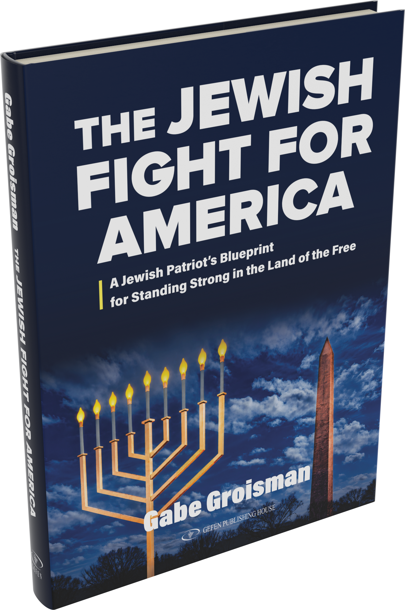 View inside
The Jewish Fight for America
 View inside
Friendship Fuels Business
 View inside
Jewish Mysticism: Essays on Maimonides’ The Guide of the Perplexed
 View inside
The Laws of Mourning
 View inside
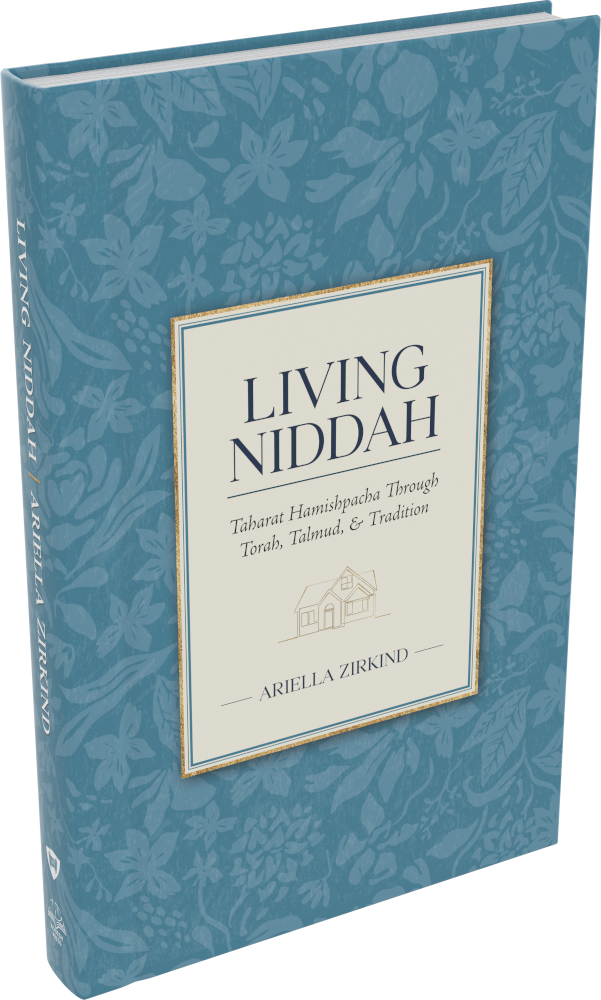
Living Niddah
 View inside
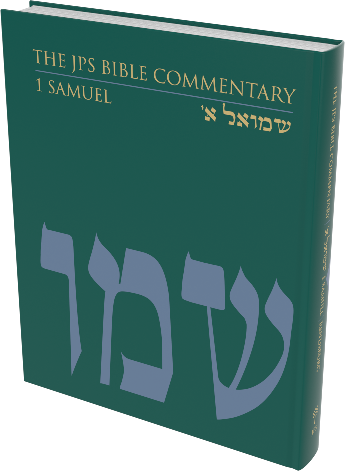
The JPS Bible Commentary: 1 Samuel
Jewish Publication Society (JPS) · University of Nebraska Press
 View inside
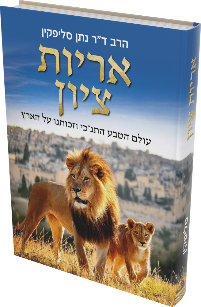
The Lions of Zion – Hebrew Edition
 View inside
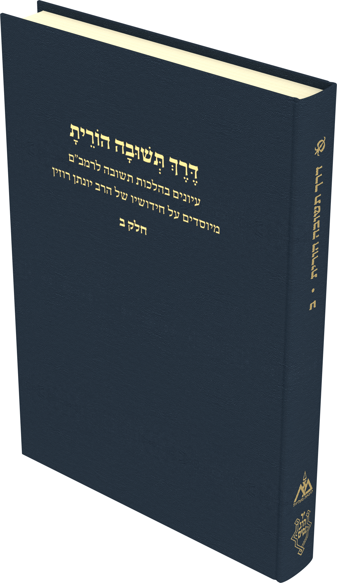
Derekh Teshuva Horeita – Volume II
 View inside
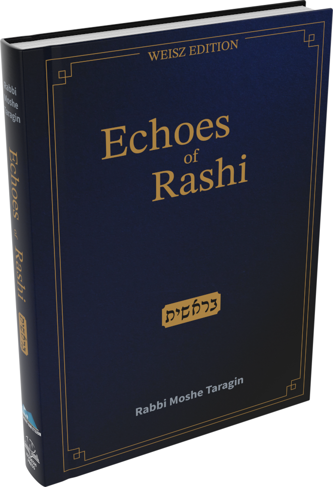
Echoes of Rashi: Bereishit
 View inside
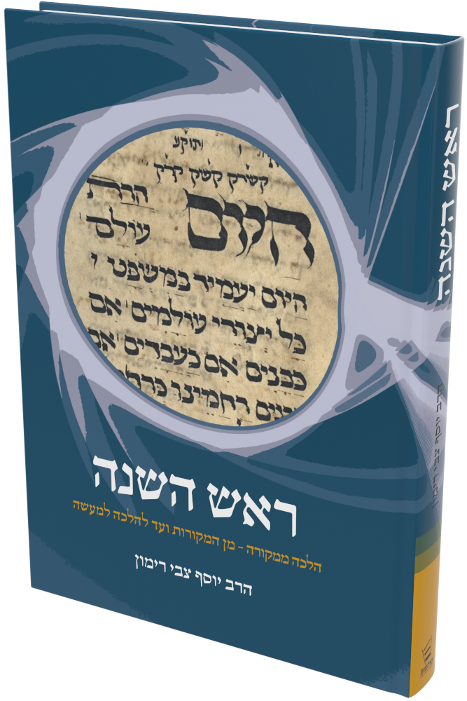
Rosh Hashanah
 View inside
Intifada Globalized
 View inside
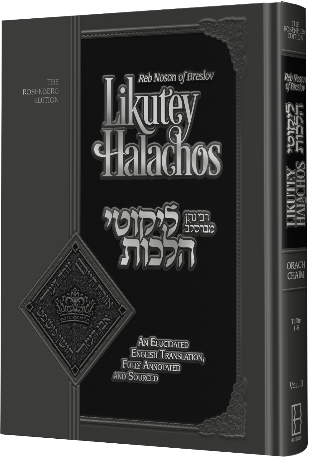
Likutey Halachos, Volume 3: Tefillin
 View inside
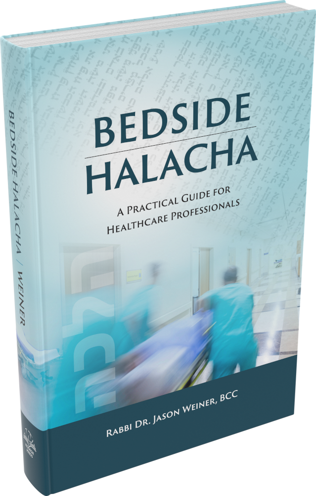
Bedside Halacha
 View inside
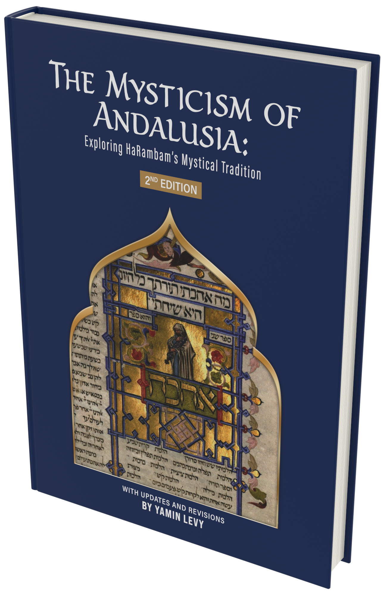
The Mysticism of Andalusia: Exploring HaRambam’s Mystical Tradition
 View inside
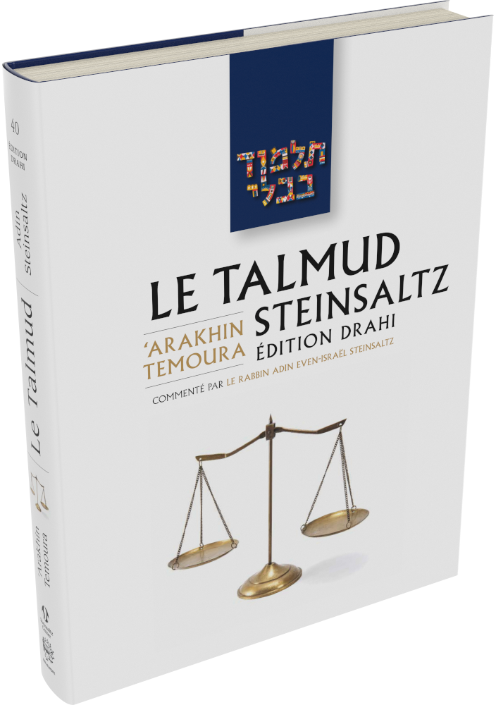
Le Talmud Steinsaltz: Arakhin – Temoura
 View inside
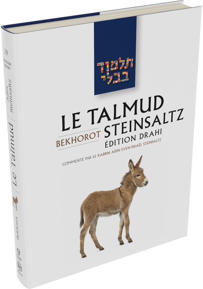
Le Talmud Steinsaltz: Bekhorot
 View inside
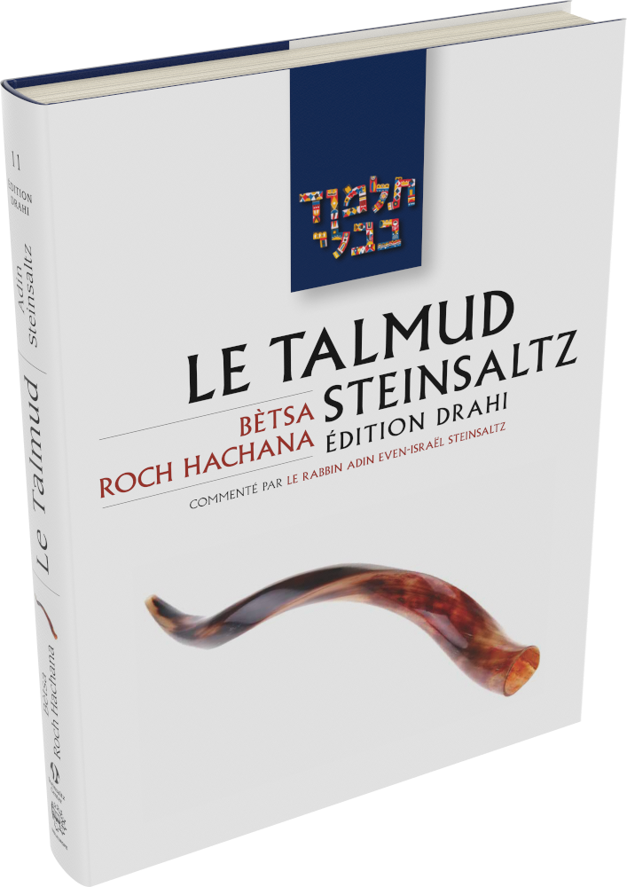
Le Talmud Steinsaltz: Betsa – Roch Hachana
 View inside
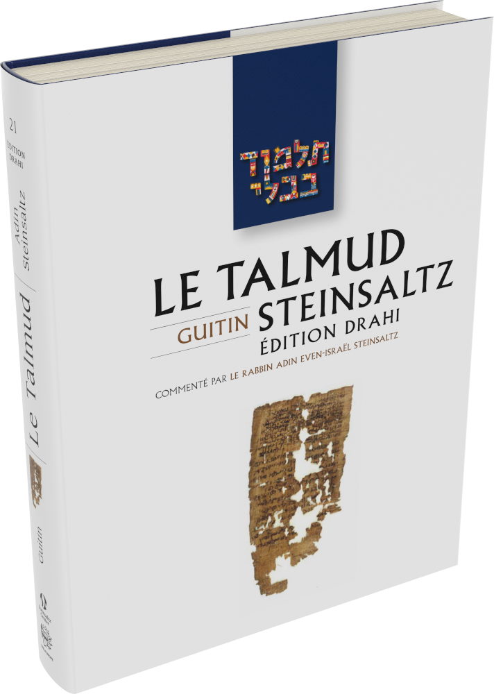
Le Talmud Steinsaltz: Guitin
 View inside
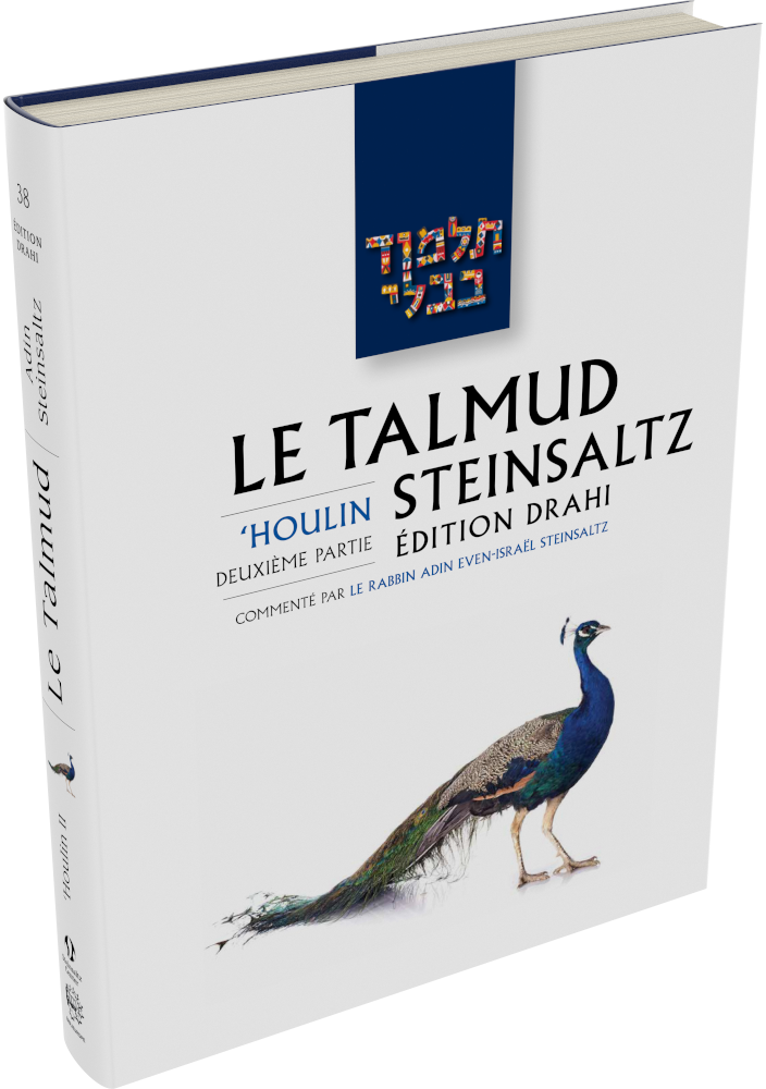
Le Talmud Steinsaltz: Ḥoulin II
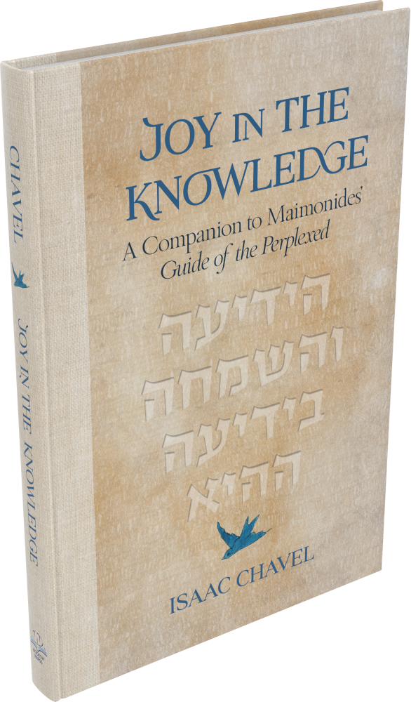
Joy in the Knowledge: A Companion to Maimonides’ Guide of the Perplexed
The English reading text is set in Arno. Spacious chapter openings lead into a single-column layout with inset quotations, occasional Hebrew terms and small-cap running heads. Numbered endnotes use a smaller setting with Hebrew passages and references, while the two-column index organises references to Maimonides’ writings.
The Jewish Fight for America
English typesetting in Arno combines a single-column reading text with small-cap book and chapter running heads and outer folios. Superscript note calls lead to collected endnotes, where hanging numbers, italic publication titles and page-range headings organise the references. Dialogue and extended quotations retain distinct paragraph spacing and speaker labels.
Friendship Fuels Business
Serif body text is paired with bold sans-serif subheadings and handwritten-style chapter titles. Grey labelled bands introduce practical action steps and chapter summaries; numbered lists use bold opening phrases and hanging indents. Drop initials mark chapter openings, with capital running heads and page numbers at the outer edges.
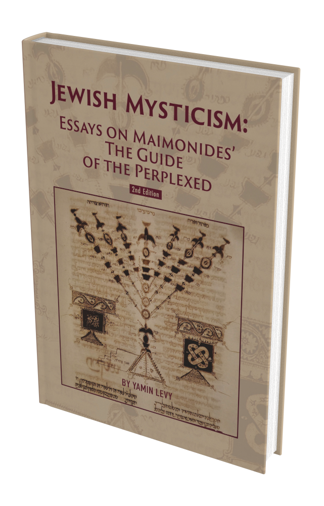
Jewish Mysticism: Essays on Maimonides’ The Guide of the Perplexed
The English text is set in Arno, with pointed Hebrew quotations in Frank Rühl. Small-cap book running heads, italic chapter running heads, drop capitals and inset quotations structure the single-column pages. Ruled footnotes, hanging bibliography entries and two-column source indexes provide the scholarly reference structure.
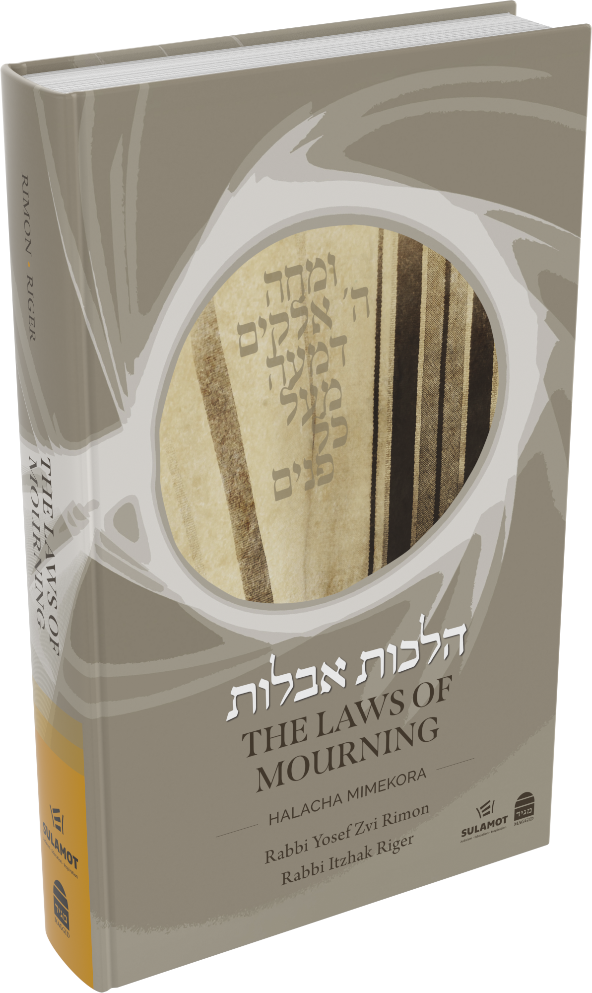
The Laws of Mourning
English serif text is paired with bold condensed sans-serif subheadings, italic terms and extensive numbered footnotes below fine coloured rules. Separate overview pages use arrow-linked boxes, shaded headings and a narrower sans-serif setting to organise practical distinctions. Small-cap running heads and outer folios link the charts and continuous reading pages.
More
Cover design: Natalie Friedemann-Weinberg, Tamar Gutman
הלכות אבלות
Living Niddah
English explanations alternate with vocalised Hebrew source quotations and indented translations. Italic running heads identify the section, while smaller numbered notes remain below short rules. Renana Typesetting’s printed credit names Elisheva Wadler for the typesetting.
The JPS Bible Commentary: 1 Samuel
English and Hebrew typesetting using Novarese, Arno and Livorna. Pointed and cantillated Hebrew and its English translation sit in parallel columns above the English commentary. Bold italic lead-ins, ruled section headings, running references and folios distinguish the layers; excursus essays use a continuous prose measure.
The Lions of Zion – Hebrew Edition
Hebrew typesetting for this illustrated edition. Single-column right-to-left text combines vocalised source passages, italic scientific names and numbered reference markers with bold subsection headings. Captioned photographs, coins and historical images are sized to the surrounding discussion. Centred chapter openings, fine rules and consistent running heads and folios give the pages a clear hierarchy.
Derekh Teshuva Horeita – Volume II
Right-to-left Hebrew prose uses bold chapter and section headings, inset quotations and occasional vocalised passages. Smaller numbered footnotes sit below short rules and accommodate both Hebrew sources and Latin-script bibliographic references. A decorative chapter marker and running heads with page numbers give the scholarly discussion a consistent structure.
Echoes of Rashi: Bereishit
The commentary combines single-column English prose with vocalised Hebrew verses, English translations and centred small-cap section headings. Smaller source notes sit beneath short rules, and the running heads distinguish the book title from the weekly Torah portion.
Rosh Hashanah
Hebrew reading pages combine blue headings, vocalised quotations and compact footnotes with coloured rules. Arrow-linked flowcharts use distinct coloured panels to compare rulings and show their sequence. Rounded shaded boxes hold longer background passages, while coloured chapter banners, running heads and folios maintain the hierarchy across the different page designs.
Intifada Globalized
Justified single-column serif text uses indented paragraphs, italic publication titles and superscript reference numbers. Small-cap and italic running heads distinguish the sections, with page numbers at the outer edges. An inset sans-serif italic pull quotation, marked by a fine vertical rule, provides a separate emphasis within the reading pages.
Likutey Halachos, Volume 3: Tefillin
English translation and commentary sit beside narrower columns of vocalised Hebrew, with two-column notes below labelled rules. Bold passages, italic transliterations and sans-serif explanations marked by grey bars distinguish the layers. Other pages set Hebrew in two columns with marginal page references, while ruled transliteration tables and labelled illustrations provide additional reference material.
Bedside Halacha
Typesetting for an English halachic handbook, with numbered provisions, nested bullet points and frequent source notes. Bold sans-serif headings distinguish lettered sections and smaller topics from the serif body text. Italic transliterated terms, superscript references and footnotes below fine rules preserve the hierarchy within compact reference pages.
The Mysticism of Andalusia: Exploring HaRambam’s Mystical Tradition
English scholarly typesetting in Arno combines centred chapter openings and drop capitals with a steady single-column text. Italic transliterations, occasional Hebrew terms, inset quotations and numbered footnotes support the discussion, while a compact two-column subject index provides a separate reference structure.
Le Talmud Steinsaltz: Arakhin – Temoura
Parallel columns align vocalised Hebrew–Aramaic passages with French translation and commentary in contrasting bold and regular serif text. Red Mishnah and Gemara headings mark transitions, while labelled notes and halachic discussion occupy the margins and lower page. Captioned photographs of musical instruments and priestly garments are integrated into this reference structure.
Le Talmud Steinsaltz: Bekhorot
Vocalised Hebrew–Aramaic text is aligned with a wider French column, using bold and regular weights to distinguish the French text’s layers. Red section labels and pale folio panels guide the sequence. Narrow outer notes, lower reference sections, a colour map and captioned photographs provide context without interrupting the parallel reading columns.
Le Talmud Steinsaltz: Betsa – Roch Hachana
Paired Hebrew–Aramaic and French columns combine vocalised source text with bold and regular French passages. Fine red rules separate the main discussion from narrow notes and vocabulary columns, while labelled reference sections run below. Plant and fish photographs and a colour-coded tithe diagram are placed alongside their explanations, with compact bilingual folios beneath.
Le Talmud Steinsaltz: Guitin
Vocalised Hebrew–Aramaic passages are paired with wider French translation and commentary columns. Red section headings, bold French phrases and fine vertical rules distinguish the text from smaller notes, vocabulary and halachic discussion. Captioned photographs sit within the reference areas, while a chapter introduction uses a broad prose measure beside a pale heading panel.
Le Talmud Steinsaltz: Ḥoulin II
Vocalised Hebrew–Aramaic passages align with French translation and commentary, with red Mishnah and Gemara headings and contrasting text weights. Labelled notes, vocabulary and halachic sections sit outside or below the main columns. Anatomical drawings, a labelled digestive-system diagram and other captioned images are fitted into the narrow reference areas.
Design philosophy
A seamlessly typeset book is always our goal for each project. Our philosophy is that a sophisticated book is like a road: it should be smooth and easy to navigate. The reader should enjoy the entirety of the story without distraction or visual speed bumps. Good typography should, ironically, be appreciated but not noticed.
Our work
We adapt fonts when a project requires it, from adding glyphs and programming ta’amim (biblical cantillation marks) to adding the marks needed to represent Arabic sounds in Hebrew-script texts. We also write scripts to solve specific typesetting problems.
Details such as oldstyle figures, ligatures, true small caps and optical margin alignment help make a page balanced and comfortable to read. We guide established publishers and first-time authors through the typesetting process, from manuscript to print-ready PDF.



 member
We’re passionate about typesetting your meticulously precise, exceptionally designed print & digital book