top of page


Markup

Search


4. To Cap or Not to Cap?
If I were to ask you what laser or radar stands for, you might be surprised to find out that they are both acronyms. You can click on the wo

Raphaël Freeman
Oct 28, 20183 min read


2. Ligatures
The most classic ligature is the fi ligature. If you look at the image at the top of this page, you will see in the Arno font, if the f and
Raphaël Freeman
Mar 2, 20183 min read


1. Text Figures (old-style numbers)
There are essentially four sets of numbers (ignoring superscripts etc.) that we need to deal with. Just like the letters of the alphabet, we
Raphaël Freeman
Feb 26, 20183 min read


3. How to Kern Like a Pro
This is the third of a 10-part series of the Ten Keys to Seamless Typesetting. Kerning is a necessary part of the typesetting process. Whereas in the past this could have meant filing the edge of a sort to fit two characters closer together, today the process is much faster. To a large extent, kerning is pre-programmed into a professional font, but not every letter combination is necessarily taken care of and even if it is, not necessarily to the liking of the typesetter.
Raphaël Freeman
Feb 2, 20181 min read
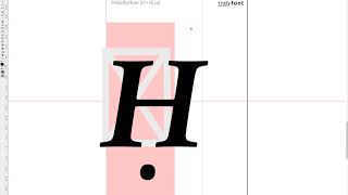
Ḥanuka
So there was a recent post on InDesign Secrets on how to find Ḥanuka in a document since it is spelt in so many different ways. One of the challenges of typesetting multilingual texts is that often special characters such as the Ḥ in the title above can be used. Not only is the ḥ common, but also ẓ, ṣ, ṭ, ḍ and even ḳ! The video below demonstrates how to create a custom ḥ in the correct font using the IndyFont Pro script. If you have a manuscript that has special typograp
Raphael Freeman
Dec 20, 20171 min read


Balancing the book
When the manuscript is complete and there are no more corrections, the next stage is the final one of “balancing” the book. This is the process whereby the recto and verso (the right- and left-hand pages in a left-to-right book) of each spread are adjusted to be the same length. The exception is the last page of a chapter, and also when a new section head starts on the recto. This is accomplished by three methods: Shorten or lengthen the spread by up to a line (ensuring that
Raphaël Freeman
Dec 6, 20171 min read


Oops I made a mistake
History It’s worth taking a step back to see how the process worked not that long ago. You would have typed up your manuscript on a typewriter. The typesetter would then have rekeyed your entire manuscript using specialised hardware or a computer system, changing your typewriter quotes to typographer quotes (or curly quotes), fixing your double hyphens to the correct dashes and so forth. The typesetter would then have printed out the galleys. These were strips of bromide (th
Raphaël Freeman
Sep 29, 20175 min read


Word vs InDesign for your Book: an Expert Analysis
The change of typeface has improved the situation overall, but it hasn’t addressed the biggest problem – spacing. In picture 3 we have taken
Raphael Freeman
Mar 9, 20174 min read


What is the Half-Title Page?
In a previous article, The Anatomy of a Book, I discussed the various elements that exist in a book. Essentially the prelims, the body of the book and the end matter. The half-title page, also called a bastard title, normally gives the book’s title without the subtitle or author’s name. It usually comes near the beginning of the prelims, though praise pages may precede it. A second half-title can also appear before the main text. These are not competing definitions of “half-
Raphaël Freeman
Feb 15, 20173 min read
Setting the page margins in InDesign
For quite some time, I would fiddle with the values until they were just so, but I decided that there must be a better way of doing this. I
Raphaël Freeman
Feb 14, 20171 min read


Boxes and Lines in Complex Layout
In the below video I demonstrate how to achieve this in InDesign as well as quickly showing another favorite typesetting trick of mine of ho
Raphaël Freeman
Jan 31, 20171 min read


How to prepare your book for typesetting
Assigning styles aren’t necessary – it just can make the process for the author, editor and typesetter more efficent. However, as long as th
Raphaël Freeman
Jan 30, 20173 min read


Typesetting Mistakes From the Inauguration Invitation – Lessons for Every Designer
This particular problem continues throughout the program. On page 6, however, things start to deteriorate. Although the designer used true s
Raphaël Freeman
Jan 27, 20173 min read


The Anatomy of a Book
I’m going to list the pages here in the order that I usually typeset books, but of course each publisher will have their own rules and it’s
Raphaël Freeman
Jan 20, 20178 min read


Hebrew Voices – Adventures in Hebrew Typesetting.
In one story (at 23:30), I explain in detail how we went about digitizing the font of the famous Koren Bible and challenges in the process.
Raphaël Freeman
Feb 10, 20161 min read


Commercial extensions
About ten days ago I was working on a project and was very frustrated. In InDesign the only way to make footnotes renumber at each chapter i
Raphaël Freeman
Dec 12, 20152 min read


Book Designer meets Programmer
When we start to deal with a chumash with an English translation and commentary, and then throw in footnotes to boot, then we are dealing wi
Raphaël Freeman
Mar 5, 20143 min read


Technology in Traditional Book Manufacture
However after typesetting there is a dispute. As a typesetter with multiple displays (yes four of them!) I prefer to receive a marked-up PDF
Raphaël Freeman
Jan 29, 20142 min read


Typesetting for Glass
Just as I was in University studying a rather unique combination of subjects, Computer Science and Printing & Photographic Technology (yes try fitting that on the top of your exam paper when they left enough space for the word: Geography), the desktop publishing revolution was in full force. This was for me very exciting, in my first year we were outputting directly to bromides at £5 a printout (which was a lot of dosh in 1989) and then the next year playing with QuarkXPress
Raphaël Freeman
Dec 3, 20133 min read
bottom of page