top of page
Search


Wonky Hyphenation
instructions on how to mark up pdf for hyphenation

Raphaël Freeman
Apr 24, 20222 min read


6. Optical Weights
Optical weights are designed to be set at different sizes so in our example above of the footnotes, we might set the footnotes in the small

Raphaël Freeman
Dec 28, 20182 min read


5. Who or What is More Superior?
This is the fifth of a 10-part series of the Ten Keys to Seamless Typesetting. In our last installment we talked about the importance of...

Raphaël Freeman
Dec 21, 20182 min read


4. To Cap or Not to Cap?
If I were to ask you what laser or radar stands for, you might be surprised to find out that they are both acronyms. You can click on the wo

Raphaël Freeman
Oct 28, 20183 min read
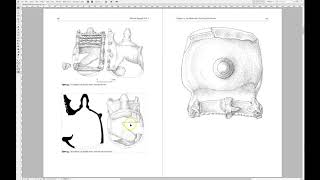

Marking the PDF after the pictures have been placed
However, if the quality of the image is not good enough for press, then the image will be imported as large as possible such that it will be

Raphaël Freeman
Mar 25, 20181 min read


2. Ligatures
The most classic ligature is the fi ligature. If you look at the image at the top of this page, you will see in the Arno font, if the f and

Raphaël Freeman
Mar 2, 20183 min read


1. Text Figures (old-style numbers)
There are essentially four sets of numbers (ignoring superscripts etc.) that we need to deal with. Just like the letters of the alphabet, we

Raphaël Freeman
Feb 26, 20183 min read


3. How to Kern Like a Pro
This is the third of a 10-part series of the Ten Keys to Seamless Typesetting. Kerning is a necessary part of the typesetting process....

Raphaël Freeman
Feb 2, 20181 min read
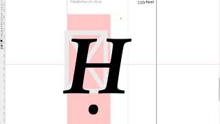

Ḥanuka
So there was a recent post on InDesign Secrets on how to find Ḥanuka in a document since it is spelt in so many different ways. One of...
Raphael Freeman
Dec 20, 20171 min read


Balancing the book
When the manuscript is complete and there are no more corrections, the next stage is the final one of “balancing” the book. This is the...

Raphaël Freeman
Dec 6, 20171 min read


Oops I made a mistake
History It’s worth taking a step back to see how the process worked not that long ago. You would have typed up your manuscript on a...

Raphaël Freeman
Sep 29, 20176 min read


Widows and Orphans: Some of the Most Common Typesetting No Nos
A widow is the last line of a paragraph at the top of a page.
An orphan is the first line of a paragraph at bottom of a page.

Raphaël Freeman
Apr 12, 20174 min read


Word vs InDesign for your Book: an Expert Analysis
The change of typeface has improved the situation overall, but it hasn’t addressed the biggest problem – spacing. In picture 3 we have taken
Raphael Freeman
Mar 9, 20174 min read


Page Margin Calculations
There are various systems in calculating the margins around the page. My favorite is the above. The top and inside ( i ) margin are 1/9 of t

Raphaël Freeman
Mar 2, 20173 min read


What is the Half-Title Page?
In a previous article, The Anatomy of a Book, I discussed the various elements that exist in a book. Essentially the prelims, the body of...

Raphaël Freeman
Feb 15, 20173 min read

Setting the page margins in InDesign
For quite some time, I would fiddle with the values until they were just so, but I decided that there must be a better way of doing this. I

Raphaël Freeman
Feb 14, 20171 min read


The Typesetter’s Dream Setup
So how does one build the ideal typesetting setup? Ultimately it comes down to the display. Not the memory, nor the processor. I even put in

Raphaël Freeman
Feb 3, 20173 min read


Boxes and Lines in Complex Layout
In the below video I demonstrate how to achieve this in InDesign as well as quickly showing another favorite typesetting trick of mine of ho

Raphaël Freeman
Jan 31, 20171 min read


How to prepare your book for typesetting
Assigning styles aren’t necessary – it just can make the process for the author, editor and typesetter more efficent. However, as long as th

Raphaël Freeman
Jan 30, 20173 min read


Typesetting Mistakes From the Inauguration Invitation – Lessons for Every Designer
This particular problem continues throughout the program. On page 6, however, things start to deteriorate. Although the designer used true s

Raphaël Freeman
Jan 27, 20173 min read
bottom of page


