
From my work at Koren Publishers
Designing the Koren Sacks Siddur
Bringing Hebrew and English together in a prayer book meant thinking about how people read, follow a service and find their place. The decisions reached from the positioning of individual vowel marks to the way a reader moves across a spread and turns the page.
I undertook this work while employed at Koren Publishers, before relaunching my independent typesetting firm as Renana Typesetting.
Rebuilding an established prayer book
The Koren Sacks Siddur was one of the most significant typographic projects of my career. The Hebrew prayer book had existed for decades. Its earlier production involved techniques such as photocopying and white-out, and my task was to rebuild it using modern production methods, clean up the typography and bring it together with an English translation. My role covered typography and interior design, as well as running the editorial and design team.
This meant reconsidering the book at several levels. The Hebrew type needed technical work; the two languages needed a workable relationship on the page; and the prayers, instructions and commentary needed distinct but related treatments. The book also had to help a person following a service, where finding the right passage matters as much as reading it comfortably.
Developing the Hebrew type
Eliyahu Koren had designed two different typefaces: Koren Bible and Koren Siddur. The Bible type needed digitising from scratch, while the Siddur type needed further work. The different shapes of the alef in the two faces are a small example of the distinct drawings behind them.

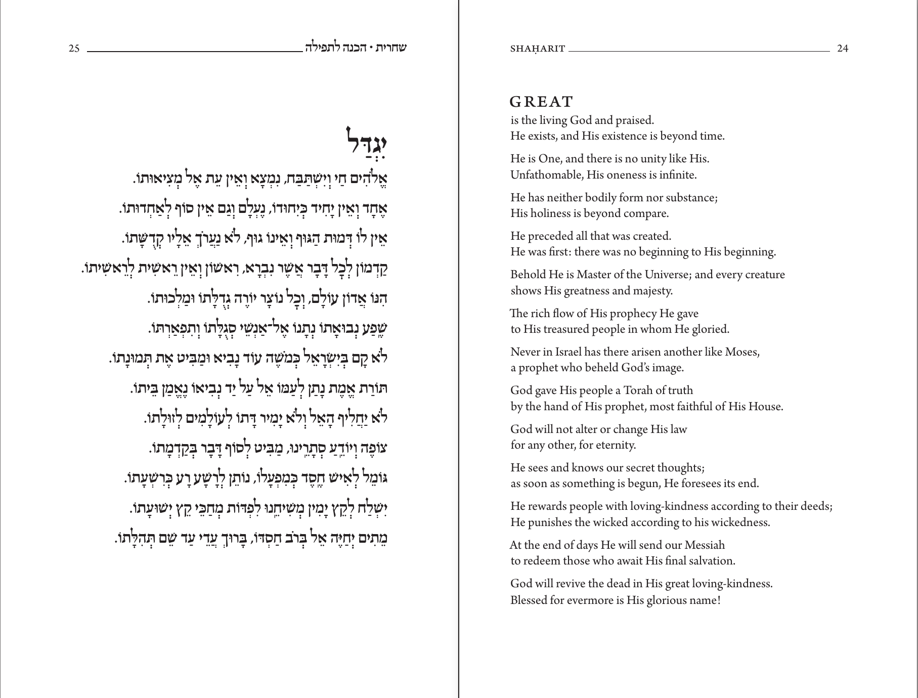
I hired Zvika Rosenberg of Masterfont to draw the letters and Arieh Marzel to program the kerning, vowel points and cantillation marks in VOLT. My contribution was to calculate the kerning pairs – the spacing between particular combinations of letters – and the positions of the vowel and cantillation marks, including their relative positions when they would otherwise collide.
In a densely pointed passage such as the Shema, the task involved the relationship between a letter and the marks around it, as well as the spacing of the letters themselves. Those adjustments are small on the page, but they are essential to the clarity of a densely pointed Hebrew text.
Which language belongs on which side?
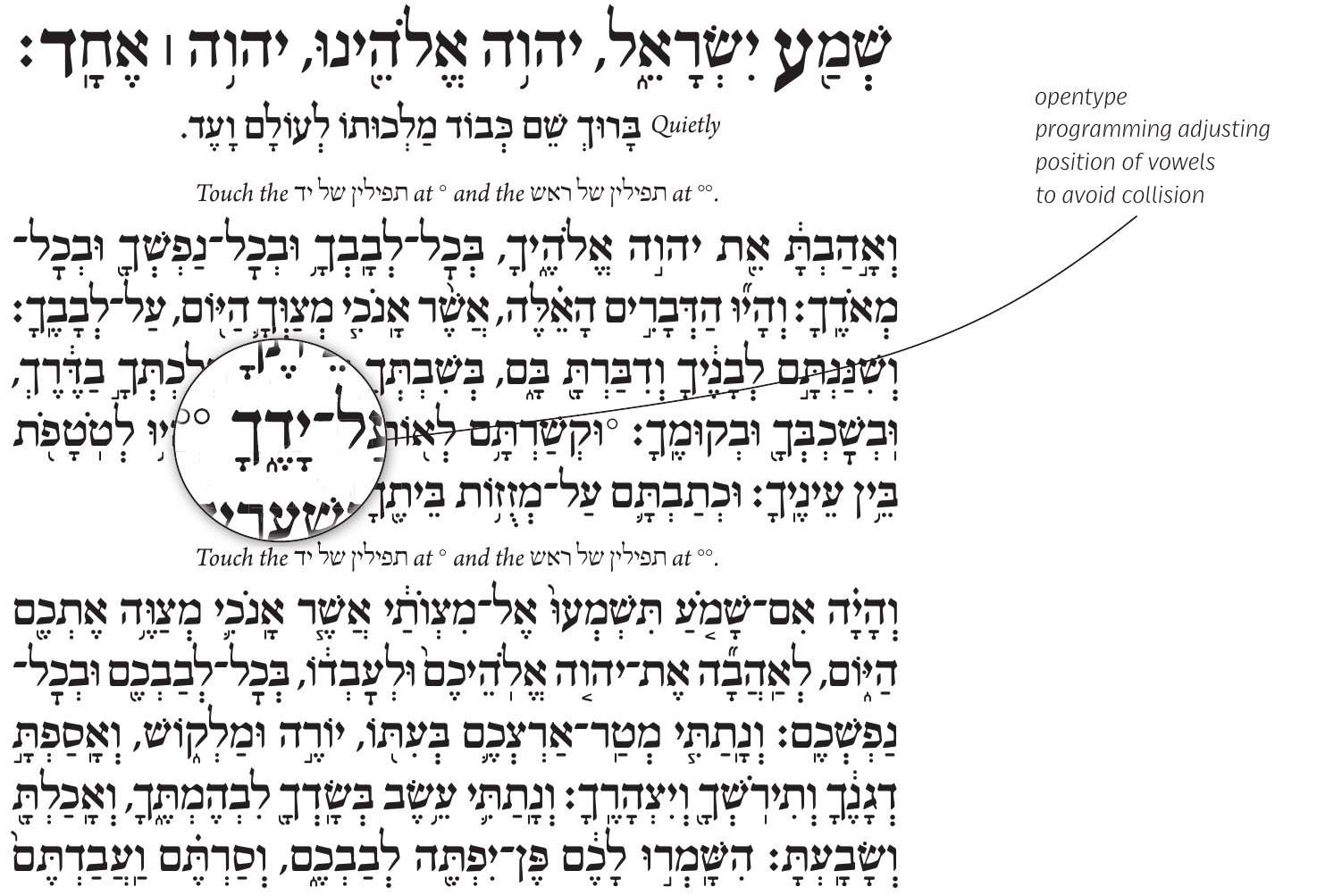
One of the largest decisions concerned the arrangement of the spread. The convention I was working against placed Hebrew on the right-hand page and English on the left. I chose Hebrew on the left and English on the right.
Many of the prayers have a poetic structure and uneven line lengths. With Hebrew on the right and English on the left, the two ragged edges face one another across the centre, producing a large, irregular area of white space. Reversing the languages brings the beginnings of the lines towards the centre of the spread and lets their uneven endings face outwards.
Yigdal provides a clear example. Its Hebrew lines and the longer English translation have different shapes and occupy different amounts of space. The arrangement gives each language room to follow its own structure while keeping the two texts visually connected. See the Yigdal spread above ↑
Giving English its own typographic character
I wanted the English to complement the Hebrew, with a character suited to its own language. I chose Arno Pro, an elegant text face with optical sizes that could serve the main prayers, smaller commentary and rubrics – the instructions that accompany the prayers.
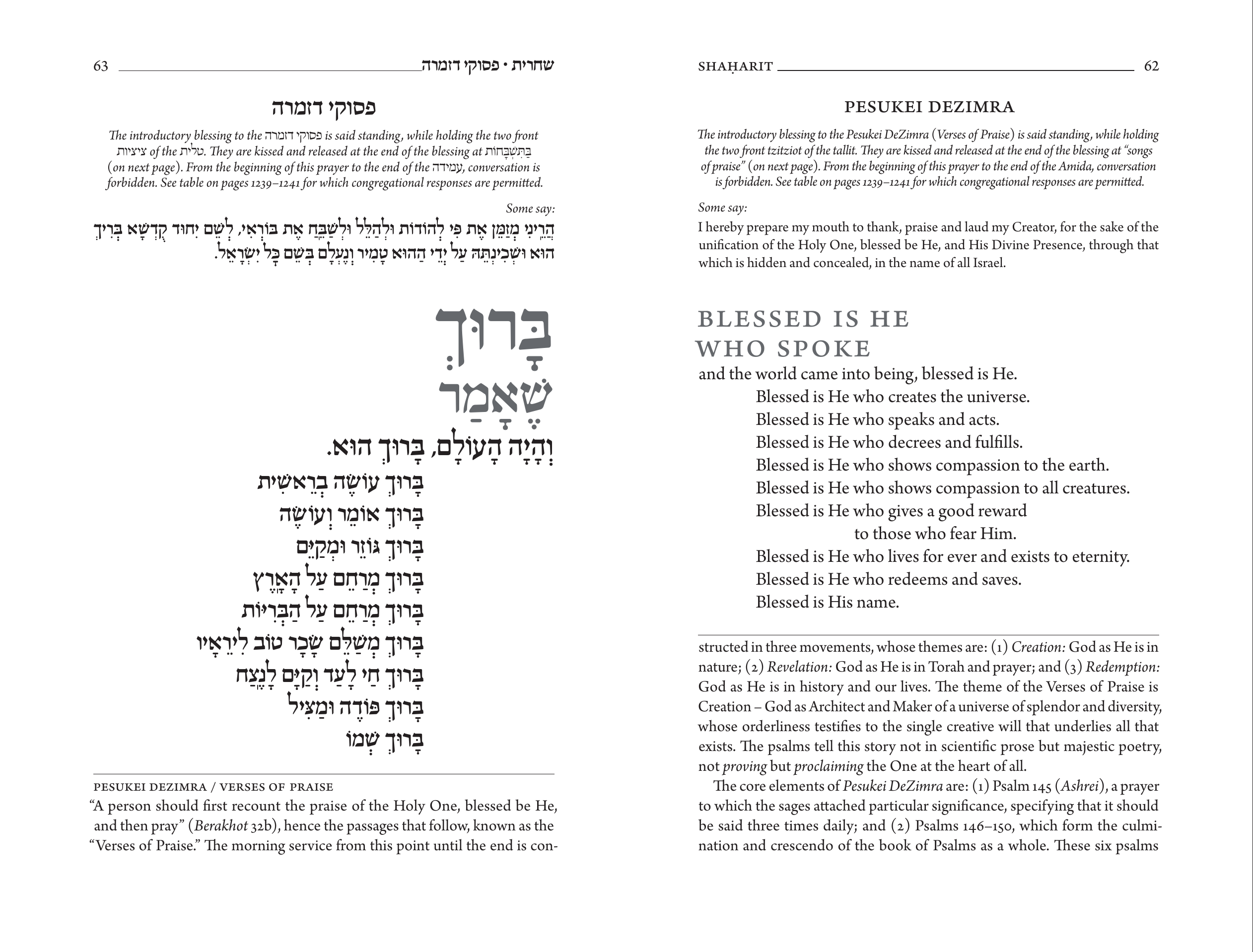
The opening words show how that approach worked. In Hebrew, a prayer could begin with a very large word. For the English, I increased the size and used small capitals. This gave the opening emphasis without simply reproducing the Hebrew treatment.
In Barukh She’amar, the enlarged opening words are set in grey. They are words to be prayed, rather than a title above the prayer. Softening their colour helps retain that connection to the text which follows. Arno Pro’s optical sizes also helped the smaller commentary maintain a compatible typographic colour: the overall density and texture of the printed text.
Keeping a prayer together
The English translation was often considerably longer than the Hebrew. One of the design requirements was to keep a prayer on a single page whenever possible. This required close attention to the fit of the text, as well as its appearance.
I adjusted the type size across a whole page in increments of 0.1 point. I considered those small changes appropriate to a liturgical book, where the prayers would be read slowly. The aim was to keep the prayer together while maintaining a comfortable reading page.
Finding a place in the service
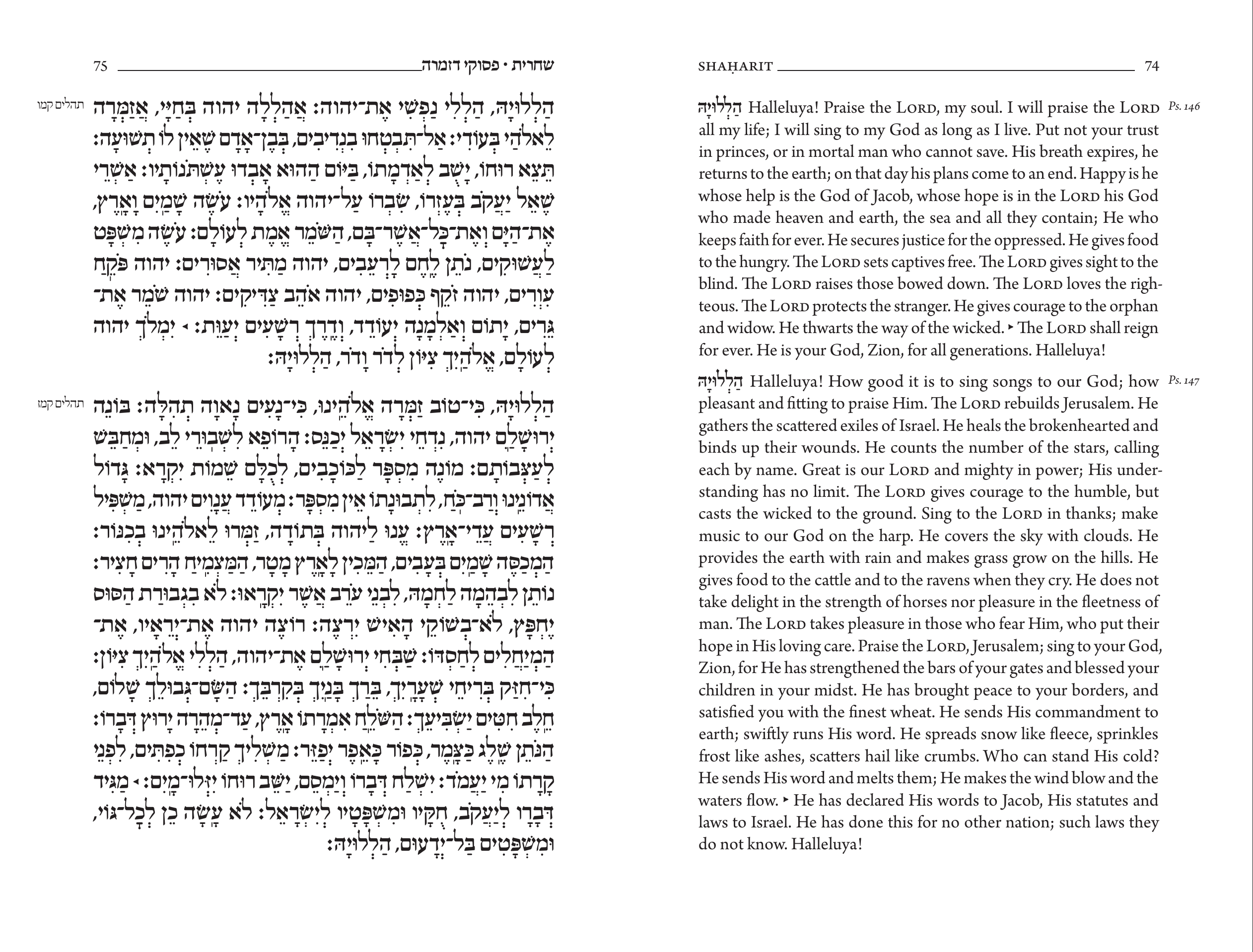
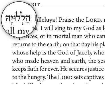
Hebrew opening words at the start of corresponding English paragraphs help readers match passages between the two languages. The pages containing Psalms 146 and 147 show the Hebrew Halleluya beside the English opening, giving the reader a recognisable point of reference.
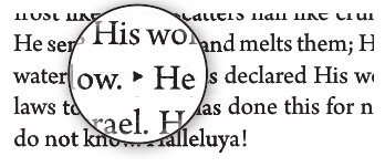
Small triangular markers indicate where the prayer leader starts reciting aloud. I placed these in the English as well as the Hebrew. A congregant reading the translation can therefore use the audible Hebrew cue to locate the corresponding point in the text.
Margins and the Hebrew writing tradition
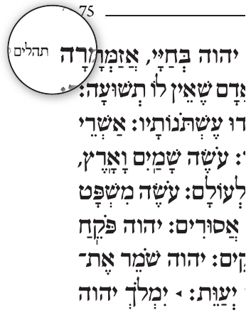
Generous margins allow sources and instructions to sit beside a prayer without interrupting its flow. On the psalm pages, the source references remain outside the main text area.
For the Hebrew notes, I aligned the tops of the main bodies of the letters in the note and the prayer. I used the same approach for instructions beside the Hebrew. This reflects the traditional relationship between Hebrew writing and its ruled line: in a Torah scroll, the letters are formed downwards from the scored rule above them.
That alignment was a deliberate acknowledgement of the writing tradition behind the typeface. It was particularly appropriate to a liturgical book containing so many biblical passages.
Following the commentary across a spread
Moving the Hebrew to the left-hand page also affected the commentary below it. Readers accustomed to the other arrangement would begin on the right and jump left across the spread. I chose to let the English commentary run from left to right.
The Barukh She’amar spread makes the decision concrete. The commentary begins beneath the Hebrew on the left-hand page, numbered 63, and continues beneath the English on the right-hand page, numbered 62. A sentence carries across that break. The reading sequence follows the commentary’s left-to-right direction even though the page numbers belong to a book that opens from right to left.
Look at the commentary beneath the Barukh She’amar spread ↑: the final “con-” on the left continues as “structed” on the right. The design has to explain the reading sequence without interrupting the sentence.
Turning the page in the introductory essay
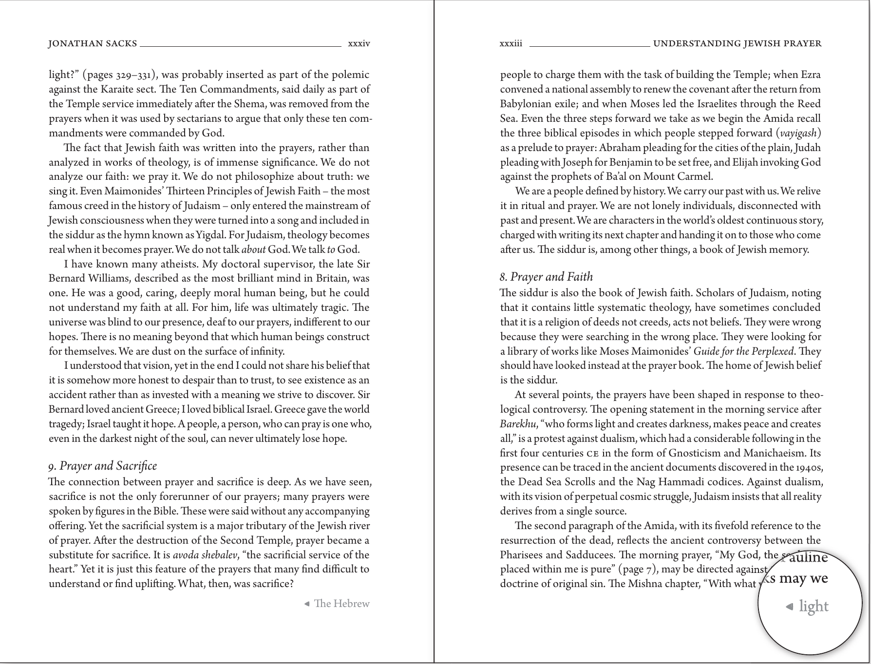
Jonathan Sacks’s long English introductory essay presented a different problem. It sits inside the same right-to-left book, and new sections had to begin on a left-hand page. The commentary solution could not simply be carried over to every page of this continuous English text.
I used an arrow together with the opening word or words of the text to follow. These cues included “light” and “The Hebrew”. These small previews tell the reader what to look for next and help make the direction of reading explicit. The “light” example continues a sentence across the page turn, so the cue works at the level of the actual text as well as pointing the way.